Matching Innovation
BRAND CASE STUDY
When your company is focusing on growth and innovation, you want your brand to showcase that too. That’s why modernizing the Tenant Turner brand was a top priority.
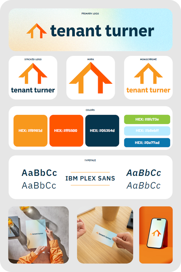
I worked closely with the team to create something that paid homage to their original roots while showing the new era. The result was a fun, bright and versatile logo and brand direction that worked on all types of assets, from digital to print.
THe PROBLEM
Why did we need to update the brand?
The Tenant Turner brand is a well known company in the real estate software industry and their original logo was loved by the team.
However, as the company grew and innovated, their needs changed and evolved beyond what they had initially created. We discussed as a team and came up with a list of what we needed to address:
-
Modernize the brand. The original logo looked dated and did not reflect the company at the present.
-
Signal innovation. The logo did not convey the company goals around technology and forward momentum.
-
Improve legibility. the original logo was overly complex and broke down at smaller sizes.
-
Reduce color complexity. Seven colors made consistent reproduction difficult across print and digital; a lean palette would be clearer and more reliable.


THe SOLUTION
A new logo and refreshed brand direction
After various iterations we landed on a direction that checked all the boxes and, most importantly, everyone loved. The new logo:
-
Modernizes the brand: The new logo feels fresh and contemporary while staying recognizable.
-
Signals Innovation: The mark clearly reflects the company's evolution and forward-looking direction.
-
Improves legibility: Simple, bold lines create a meaningful symbol that reads well at any size.
-
Reduces color complexity. A streamlined three-color palette improves consistency across print and digital.
-
Strengthens partner alignment. The updated logo pairs cleanly with partner brands and holds equal visual weight.
THe OUTCOME
Better brand recognition
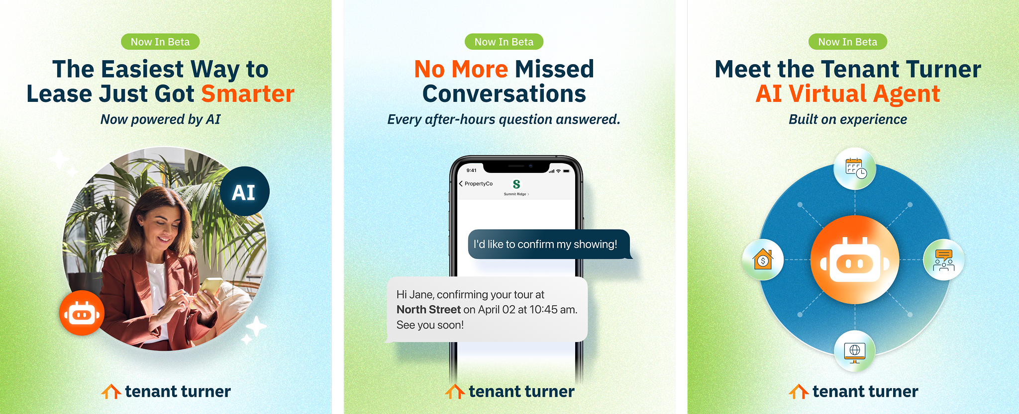
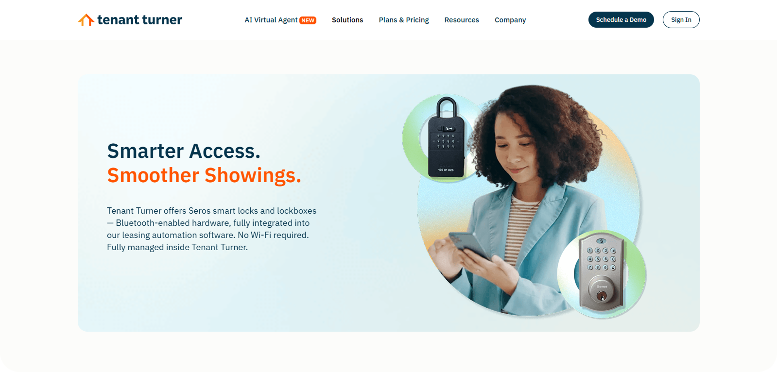
The new Tenant Turner logo and brand direction was applied on the software, social media, print graphics, website and many other assets.
It is now more easily distinguishable and matches the goals and direction the company is heading to.