Shifting Visuals.
BRAND CASE STUDY
Your brand has a good foundation but now you need to shift it in a new direction. That’s when updating your brand visuals and establishing strong style guidelines is key. At ShowMojo, we worked on updating the brand direction to showcase just that.
THe PROBLEM
Why did we need a new direction?
The ShowMojo brand had the foundations of a brand, a rebranded logo and a strong color palette. However, the brand direction wasn't completely aligned with the company's new goals. As a team, some of the pain points to address were the following:
-
The brand direction felt dark and intimidating when using the black as a primary background color
-
The type of design elements did not convey a modern look
-
The type of images and design layouts were not consistent since there were no guidelines established.


THe SOLUTION
Updating brand direction
Rather than doing an abrupt rebrand, we slowly shifted the brand direction while establishing guidelines.
-
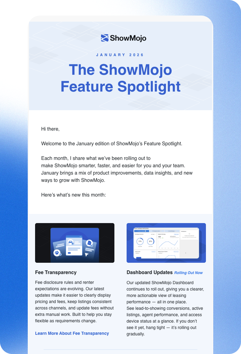
Designing for our customers: We swapped the black backgrounds to whites and blue gradients. This gave a more friendly and warm tone that was more accurate to the real estate industry and our customer base.
-
A modern look: We implement soft gradients with a grainy texture. These are currently a modern look that implies innovation while keeping an analog human touch.
-
Creating guidelines: We set rules for the team in the type of elements we used across assets such as images, icons or illustrations. This helped enforce brand awareness by keeping consistency.
THe OUTCOME
A modern brand
The new brand direction helped the brand have a stronger presence . By updating the visuals to resonate with our industry and customers and ensuring consistency, our outcome was better brand awareness that we could continue to build on.